
Realique
A task management app that assists graduate students in creating realistic and flexible schedules and making automated adjustments on the go.

Project overview
As a university professor observing the rising issue of students' poor work-life balance leading to high dropout rates, I began exploring how technology could be harnessed to support students more effectively. This concern led to the development of an app specifically designed to address these challenges.
My role
As a product designer I was responsible for conducting user research, conceptual and visual design and user testing build this app.
PROBLEM SPACE
45% of graduate students fail to complete their degrees
Professors observe that 45% of graduate students fail to complete their degrees, and students cite a poor work-life balance as the major cause of this.

Goals
🔹 Employ the Double Diamond method to refine this broad problem into a clear actionable product.
🔎 Find the root cause of students’ poor work-life balance.
📱Figure out how we can support students by using technology, improve their work-life balance, and finish their degrees.


01 DISCOVER
Investigative research
My preparation involved reading articles, white papers, and case studies on students' work-life balance challenges. I also drew from my experience as a professor, observing and noting student behavior. Additionally, I analyzed success stories using key project management techniques like PERT to select valuable strategies for this product. After my investigative research, I developed the following three hypotheses:
Hypothesis 1: Students do not set realistic expectations about what they can do daily.
Hypothesis 2: Students do not create a regular to-do list.
Hypothesis 3: Students do not prioritize their tasks and focus on most important activities.
User resaerch
For my research part of my project, I conducted 30-minute user interviews with 10 graduate students who struggle with balancing their work and life to test out my three hypotheses and here is the result:
“I write a to-do list and think I can finish my tasks, but they take longer than expected.”
“I prioritize my weekly tasks but still struggle to complete them all.”
“I usually underestimate the time my tasks take, so I rush until the very last minute.”
“I set high expectations for myself, so my schedule often feels overwhelming.”
Hypothesis 1
⭐️⭐️⭐️⭐️⭐️⭐️⭐️⭐️
8 out of 10 students proved that they could not complete their tasks as expected which supports the first hypothesis.
Hypothesis 2
⭐️
1 out of 10 students said she did not create a regular do-to list to juggle her tasks, but the rest did, so the second hypothesis is not validated.
Hypothesis 3
⭐️⭐️
2 out of 10 students said they did not prioritize their tasks, but the rest did, so the third hypothesis in not validated.
Main insight
Graduate students challenge balancing their work and life because they do not have realistic expectations about what they can do on a daily basis.
Other Insights
Students find work-life balance apps complicated, confusing, and stressful because of too many to-do lists and reminders.
Due to the nature of graduate school, students rely on a weekly schedule rather than on a daily or monthly calendar.
Checking tasks off a list and seeing the progress seems very rewarding to students.
Validated Hypothesis Deep Dive
I analyzed the major causes of unrealistic expectations in students, and I concluded that they stem from four biases and can be managed with effective time and effort management techniques.

Bringing users to life via personas
Based on the research, I created three personas to make their goals, motivations, needs, and pain points memorable throughout the design process. These personas represent three types of users: an overambitious PhD student, an MFA student with a disability, and an MBA student working full-time.


02 DEFINE
Refined Problem Statement
After multiple research rounds, I refined and narrowed the initial broad problem statement:
Graduate students struggle with time management and overestimate their capacity to complete tasks.
User stories
To stay aligned with user needs, I wrote these User Stories to highlight the app's core features that help users achieve their goals.
As a graduate student I need to:


03 IDEATE
Brainstorm Workshop
Based on the research outcomes I developed and conducted a brainstorming design workshop and live sketching to explore what this product could look like.

Transforming concepts into viable user flows
After the design brainstorm session, I organized the screens, Identified any gaps, and attempted to map out the entire product’s user flows.


04 LOW FIDELITY DESIGN
Creating low fidelity wireframes
Using the insights from the workshop and the review process for creating viable user flows, I created low-fidelity wireframes to represent the screens and made prototypes from them.


06 USER TEST ROUND 1
Guerrilla usability test and outcomes
I created a clickable low-fidelity prototype and conducted a Guerrilla usability test with five students to identify design issues. I uncovered pain points in automated task adjustments and productivity analysis, leading to these changes.

Adding ''Override warning notification"
Flow: Automated task adjustments
To address users' frustration with accidental double-bookings, I added an override warning. Now, the app alerts them if a slot is already taken, helping prevent this common mistake.

Adding ''Override warning notification"
Flow: Automated task adjustments
To address users' frustration with accidental double-bookings, I added an override warning. Now, the app alerts them if a slot is already taken, helping prevent this common mistake.

Making the analysis info understandable
Flow: Productivity analysis
I noticed that users were confused about the meaning of the bars. To address this, I created a card that clearly displays the numbers of early, on-time, and late tasks.

07 HIGH FIDELITY DESIGN & PROTOTYPE
Exploring the visual language via mood board
Before moving to high-fidelity prototypes, I created a mood board with smooth colors, small illustrations, and curvy corner cards to craft a UI that conveys joy and peace to stressed students.

UI iterations
I selected one of the most crowded screens to test the mood board and developed different design iterations. Bellow is a selection of some of these iterations with different layouts, colors and fonts. I decided to choose the highlighted due to its consistent design and enhanced accessibility achieved through contrasting colors and appropriate font size.

UI style guide and components
After selecting the best iteration, I tested it for accessibility, then designed a UI style guide based on it and developed the ready to code components for Realique. I chose green for its calming effect, Poppins for its friendly, modern look, and added 2D and 3D illustrations to keep users engaged and optimistic.


High fidelity design
After developing a visual system and testing it for accessibility, I designed all the MVP (minimum viable product) screens and the prototype to ensure a detailed and accurate representation of the final product.


06 USER TEST ROUND 2
Final round of user testing
After finishing the high-fidelity prototype, I ran a 30-minute user test with five users via Zoom .
The users were able to complete all tasks but I found an important issue, confusion about the purpose of timer.
Pain points
Users were unclear about the purpose of a 25-minute timer.
They preferred more timing options.
They needed to view the duration of tasks.
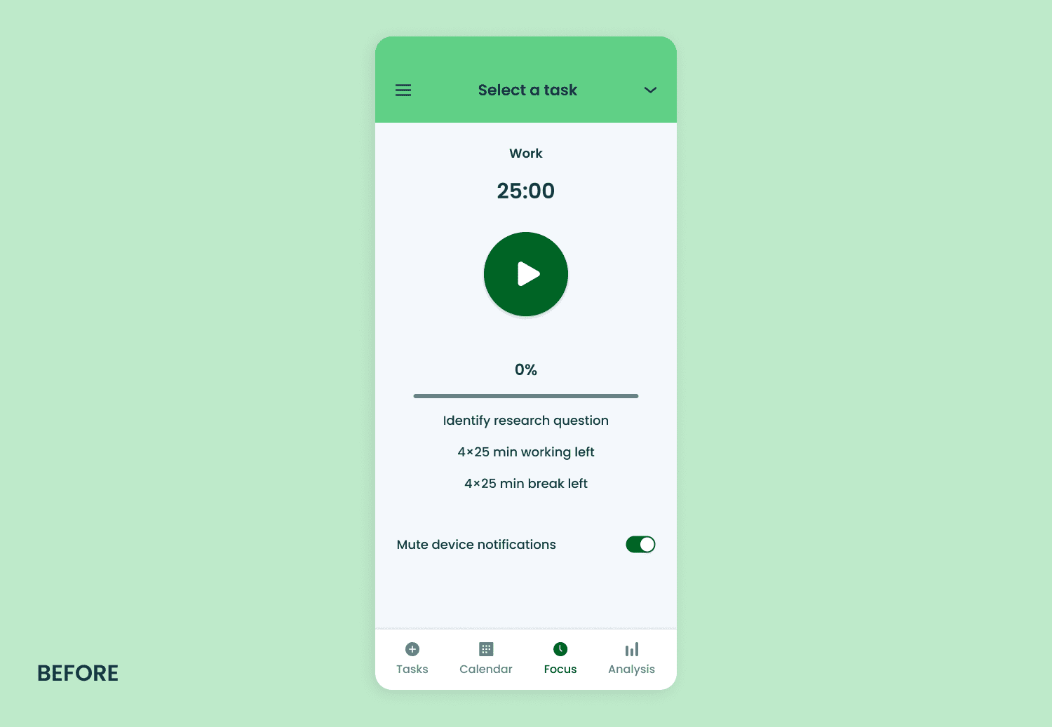
"4×25 min working left" and "4×25 min break left" were not understood correctly.

Refinements
Descriptive Banner: Added a banner explaining the 25-minute work/5-minute rest timer to first-time users.
Timer Customization: Allowed timer adjustment between 20-30 minutes, sticking to the Pomodoro technique.
Task Duration Visibility: Enabled users to see task durations after adding them to the timer.
Simplified Info: Removed unnecessary details about the timer to ensure clarity.

SOLUTION
For efficiency this protype iclude a selcted sets of flows.
😴 Syncing the calendars and blocking the time off
When users land on the app's home page, they see two banners: one to sync Realique with other calendars, preventing task conflicts, and another to block off personal time, ensuring work-life balance.

✏️ Creating a task
Users can add tasks to their calendars by selecting an icon, assigning a color code, and setting start/end times and dates. They can also describe the task for a smoother workflow breakdown.

⛏️ Breaking down the task
Students often underestimate the complexity of tasks, leading to unrealistic expectations. Realique solves this by automatically breaking tasks into smaller, manageable subtasks, making them more visible and achievable.

🧮 Estimating Task Duration with PERT Method
Students often struggle with overoptimism in scheduling. Realique tackles this by using the PERT method, which combines user input to calculate realistic task times. It guides users, offering accurate time estimates for better planning and more reliable schedules.
PERT Estimate= (O+4M+P)÷ 6
Optimistic Time (O): Best-case scenario; task done under ideal conditions.
Most Likely Time (M): Realistic estimate, factoring in usual challenges.
Pessimistic Time (P): Worst-case scenario; task delayed by unexpected issues.

⏳ Task Cards
Once the task is created in the app, it is displayed with a task card to show the users the task details and progress.

🔃 Task adjustment
Research shows that students often stick to their original plan, even when changes are needed. A user can edit any task which prompts Realique to quickly adjust the subsequent tasks based on this change.
In addition to help students unwind, Realique sends cheerful messages with funny illustrations every Saturday and Sunday, easing their stress.

⏱️ Countdown timer
Students often face burnout from working without breaks. The Pomodoro technique helps by letting users set a 20-30 minute work timer, followed by a 5-minute break, promoting focus and mental refreshment.

📊 Analysis of performance
Maintaining a realistic schedule and work-life balance requires accurate self-assessment. Realique helps by offering detailed weekly and monthly performance reports. These reports highlight metrics like late, on-time, and early task completions, while fun animal avatars add a touch of encouragement to the experience.

Outcomes and reflections
The results from the two usability tests reveal that users found Realique functional and user-friendly, with high praise for its modern, sleek visual design. They particularly appreciated the creative and helpful approach to estimating task duration and analyzing performance. However, some areas for improvement were identified:
Integrating aspects of gamification into the Analysis page could motivate students to complete their tasks.
Adding a yearly report feature could provide long-term insights for users.
Creating Realique has been a rewarding journey throughout the entire UX research and design process. Developing this app provided me with hands-on experience in analyzing user behavior and transforming these insights into a practical design solution.
